Capisec
Make complex security data feel obvious.
Capisec
Make complex security data feel obvious.
Capisec had a powerful scanner and a terrible problem: customers kept saying the results felt like a wall of text. Our job was to make the data legible without dumbing it down.
The brief
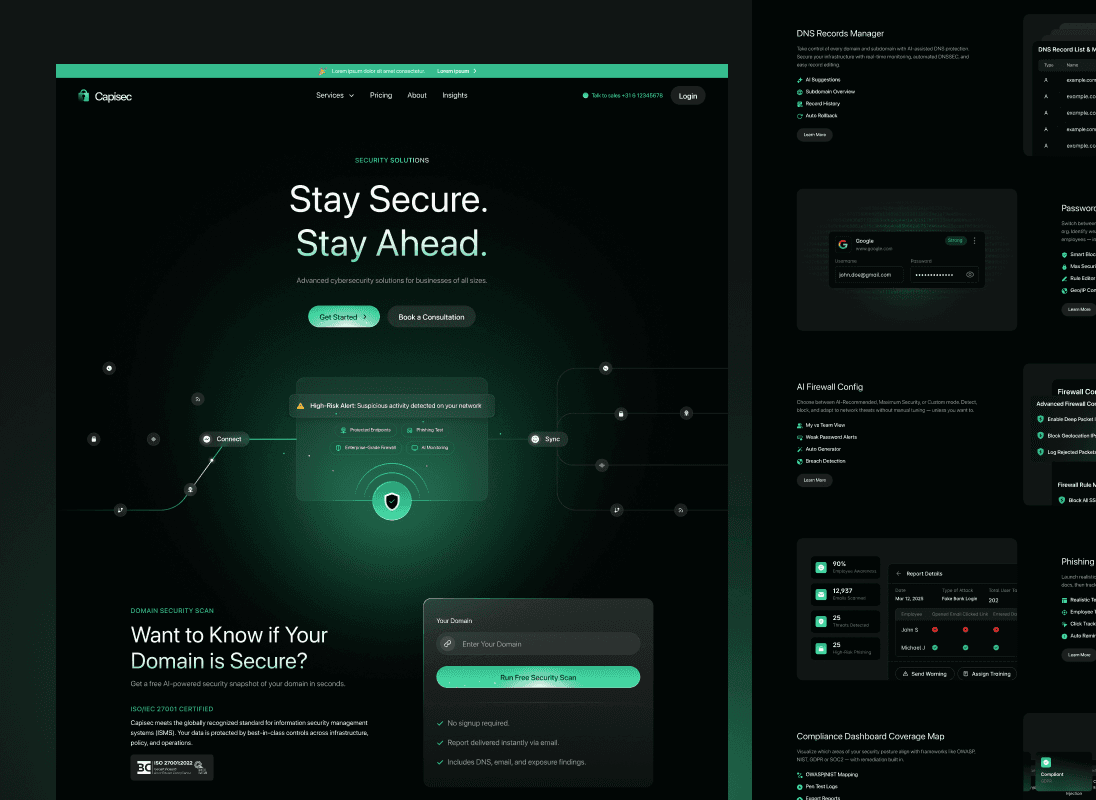
Capisec is a cybersecurity platform that continuously scans domain infrastructure for vulnerabilities. We redesigned the marketing site and the customer-facing dashboard, with a special focus on making scan results feel intuitive at a glance. Motion was used sparingly but deliberately to walk users through the scan process and give the dashboard a sense of motion that reinforced trust.
What we solved
Security professionals don't have time to read. They need to scan a dashboard, spot what's critical, and act. Capisec's existing dashboard buried important data inside long tables, which meant customers were only acting on alerts that someone happened to surface manually. The marketing site had a parallel problem: it told visitors what the product did but never showed them, so demo conversions were stuck below industry benchmarks.
How we got there
We started by mapping the security analyst's actual workflow: arrive at dashboard, triage, fix, document. The redesign rebuilt the dashboard around triage. Severity got color, frequency got size, recency got position. The marketing site got an interactive scanner demo on the hero so visitors could see the product working before they ever booked a call. Rive animations replaced screenshots for the explainer sections.
What we shipped
The new dashboard collapses scan results into a triage view with critical issues at the top, full historical context one click away. The redesigned marketing site leads with an interactive demo, then walks visitors through the actual review experience using motion to compress what would have been a five-screen explainer into a single scrollable section.
What changed for the client
Demo-to-close rate doubled within a quarter of relaunch. Customer success reported that average scan-review time dropped from twenty minutes to five, which was the headline win the Capisec team had been chasing for over a year.
Frequently asked.
Questions that come up most often when companies reach out about projects like this.
Yes. Dashboard redesigns are some of the most common AXI Launch engagements we run. We start with a workflow audit, prototype the new triage views, then build out using Webflow, Next.js, or whatever stack the client team is comfortable maintaining.
Motion has to earn its place. On Capisec, we used Rive specifically for moments where motion helped explain a concept faster than static UI could. Hero scanner demo, severity triage, and historical drill-down all got motion. Everything else stayed quiet.
Often the better approach. When a marketing site and a product UI share visual language, both feel more polished and conversions tend to improve. We ran them in parallel for Capisec on a single engagement.
Figma for design, Webflow for marketing, and the client's stack of choice for product. For Capisec we extended their existing React codebase rather than rebuilding from scratch. Picking your battles matters more than picking trendy tools.
Want something like this for your team?
Book a Call →AXI Studio
Subscription1 active slot at a time. Pause, scale, or cancel any time.
AXI Launch
Fixed PriceOne project, one price. Scoped to your needs and delivered fast.
Starting atAXI Automate
AI WorkflowsAI agents and automations that replace manual workflows.
Starting atAXI Search
AEO + SEOBe the answer AI gives. Plus the Google work to back it up.
Starting at