Monarch
Your money, all in one calm view.
Monarch
Your money, all in one calm view.
Monarch was an internal concept inspired by a frustration nearly every investor we know shares: their portfolio is scattered across four brokerages, two crypto wallets, and a spreadsheet. We sketched the calm aggregate.
The brief
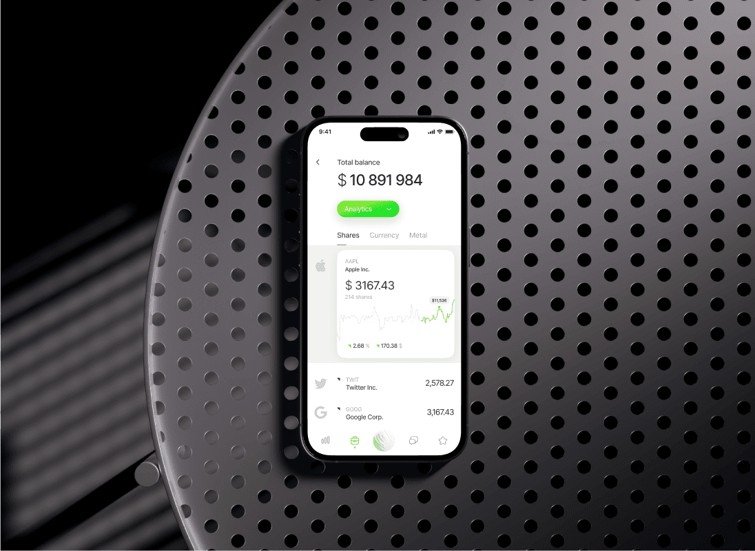
Monarch is a concept design for an investment portfolio tracker that connects brokerages and crypto wallets into a single view. Clean typography, calm color palette, and a deliberately quiet interface compared to the neon-blue dashboards every investing app defaults to. We designed the iOS and Android concept across nine weeks.
What we solved
Investing apps optimize for engagement, which is the wrong incentive for personal investing. Endless price tickers, red-and-green pulses, and notifications that dramatize every dip get clicks but make users worse investors. Monarch had to feel like a quarterly review tool, not a casino dashboard, while still delivering the practical aggregation users want.
How we got there
We anchored the design around the long view. The home screen leads with the quarter or year, not the day. Individual asset performance is one tap away but never on the surface. The brand uses cool grays and a single warm accent rather than the typical green-and-red oscillation. Plaid sketches handle brokerage connection. Wallet connect flows handle crypto.
What we shipped
The Monarch concept lands on three primary surfaces: portfolio (the calm overview), assets (drill-down per holding), and accounts (connection management). Charts show months and quarters by default with day-level data hidden until requested. Notifications, where they exist, are quiet and contextual.
What changed for the client
Monarch published as an internal portfolio piece, hit Product Hunt's top of the week as a concept showcase, and informed an active client engagement in the personal investing space.
Frequently asked.
Questions that come up most often when companies reach out about projects like this.
It's an AXI internal concept. We use concept work to push our craft in product spaces we find interesting. Monarch specifically explored what calm UX could look like in a category dominated by engagement-driven design.
Yes. We've shipped Plaid-integrated fintech products including FinVix and EasyFinance. Aggregating brokerages is similar in shape, with the added complexity of crypto wallet connection on the chain side.
Quieter defaults, slower default time horizons (quarters not days), restrained color palette, restrained motion, and information hierarchy that promotes context over alerts. The pattern shows up across Mintro, Monarch, and Nova.
AXI Launch for the initial build. AXI Studio for ongoing iteration. Most personal investing apps need to evolve their charting and notification systems heavily post-launch.
Want something like this for your team?
Book a Call →AXI Studio
Subscription1 active slot at a time. Pause, scale, or cancel any time.
AXI Launch
Fixed PriceOne project, one price. Scoped to your needs and delivered fast.
Starting atAXI Automate
AI WorkflowsAI agents and automations that replace manual workflows.
Starting atAXI Search
AEO + SEOBe the answer AI gives. Plus the Google work to back it up.
Starting at